
Artists who use text in their work? They’re not just playing around. They know that every little detail counts, from the way they put paint on the canvas to the colors they choose and, of course, the fonts they use. These artists understand that typography is a powerful tool for conveying meaning, getting people all emotional, and making them question everything they thought they knew.
Find books on some of these artists in the Glitch Library, check the links so you jump easily through space, time and book stacks.
The Sans-Serif Standouts
When it comes to making a bold statement, sans-serif fonts are a go-to choice for many contemporary artists.
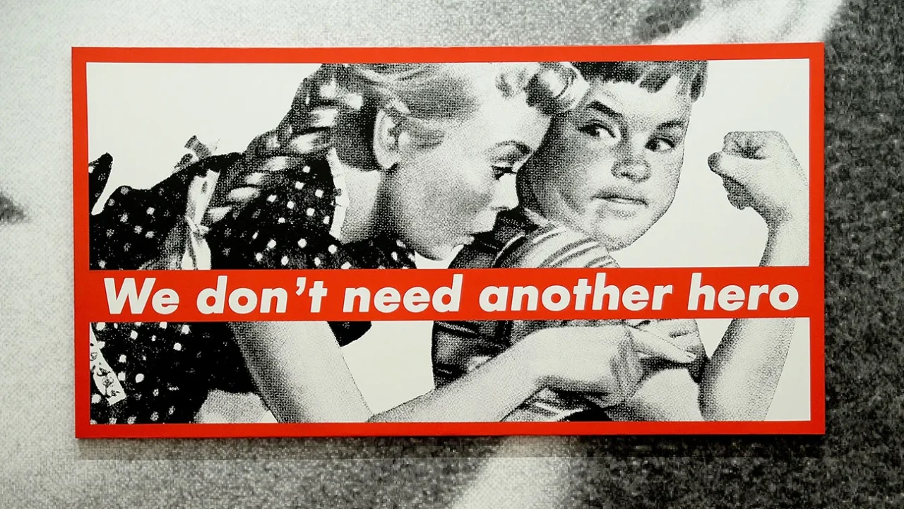
Take Barbara Kruger, for instance. She’s not here to play games with her bold, in-your-face statements. Her go-to style? Futura Bold Oblique. It’s like she’s grabbing you by the collar and yelling, “Pay attention!” She knows exactly what she’s doing with that font choice, and it’s all part of her master plan. (Find Barbara Kruger: Thinking of You. I Mean Me. I Mean You in the Glitch Library)
Similarly, Christopher Wool’s text-based paintings often employ Helvetica, a font whose clean, modern lines echo the stark, uncompromising nature of his words.

But sans-serif fonts aren’t just about being loud and clear. Glenn Ligon’s use of Impact in his “Untitled (I Am a Man)” and “Condition Report” series adds a sense of urgency and weight to his explorations of race, identity, and language. And let’s not forget Jenny Holzer, whose “Truisms” have graced everything from posters to LED displays in fonts like Helvetica and Franklin Gothic, proving that sometimes, the simplest typefaces can speak the loudest.


Custom Creations and Hand-Drawn Delights
For some artists, the perfect font is one that doesn’t exist yet. Enter the world of custom typography, where letterforms are crafted to suit the specific needs of the artwork. Mel Bochner’s “Blah Blah Blah” series features his own creation, the Artforum font, designed to mimic the iconic magazine’s masthead. The result? A typeface that’s as much a part of the art as the words themselves.

Other artists prefer the raw, organic feel of hand-drawn fonts. Kay Rosen’s playful, expressive letterforms are a perfect match for her witty, language-based works, while Shantell Martin’s freestyle lines and Stefan Sagmeister’s scrawled musings add a touch of intimacy and authenticity to their respective projects.

Deconstructing and Reconstructing the Alphabet
But why stop at just using fonts when you can reimagine them altogether? Tauba Auerbach‘s “Alphabetized Bible” series takes the sacred text and turns it on its head, reorganizing the words in alphabetical order and rendering them in a crisp, sans-serif font. The result is a mind-bending exploration of language, meaning, and the very nature of communication itself.
Similarly, Lawrence Weiner’s text-based installations often feature fragments of words and phrases, set in bold, sans-serif fonts that invite the viewer to fill in the blanks and construct their own narratives. It’s a testament to the power of typography to not just convey meaning, but to actively engage the audience in the creation of it.

The Environmental Impact
But fonts aren’t just confined to the flat surface of a canvas or a screen. In the hands of artists like Doug Aitken, typography becomes a three-dimensional, immersive experience. His “MORE” sculpture, featuring giant mirrored letters that reflect the surrounding landscape, blurs the line between art and environment, challenging viewers to see themselves and the world around them in a new light.

The Final Word
So, the next time you find yourself face-to-face with a text-based artwork, take a moment to appreciate the artistry behind the typography. From the bold, unapologetic statements of Barbara Kruger to the mind-bending alphabetical acrobatics of Tauba Auerbach, the fonts used by contemporary artists are as much a part of the message as the words themselves.
Further reading
If you want more text-based art check out the book index for more titles in the glitch library, from Art and Text from Black Dog Publishing to Vitamin Txt: Words in Contemporary Art from Phaidon. Be sure to ask Dan Stanescu about it on your next visit, help point you in the right directions for sure.


******
Glitch Shop is a knowledge sharing space and an idea exchange place. Drop on by Thursday and Friday, join our mailing list and stay tuned for our regular programme of artist talks and design sessions.